
Assessing the latest BoE forecasts

Headline numbers
The Bank of England is now forecasting a much shallower recession compared to their last set of forecasts from November:

But, they are still significantly more pessimistic than the OBR or the private sector forecasters:

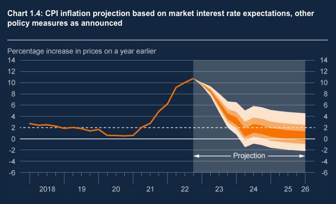
The Bank’s February forecast has inflation coming down more quickly than in November:

Bailey did however claim that the upside risk on this inflation forecast was the ‘greatest in the history of the MPC’. From the forecasts themselves it’s quite hard to see this but it’s true that the uncertainty skews upwards in the confidence intervals:
The mean rather than the mode of the forecast also shows more upside risk than the November equivalent:
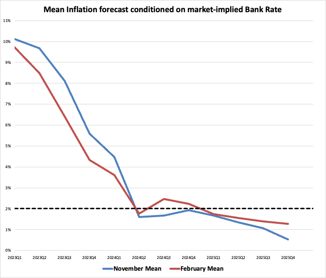
But even then, it’s not exactly showing loads of upside risk.
Changes driving the change in short term economic outlook
Lower future gas prices and a lower interest rate path were the two main factors pushing up the short term output forecast.
The change in gas prices is really significant:

This should hopefully convey a more realistic picture of prices going forwards now that many of the problems in the financial functioning of European gas markets have either been resolved or are expected to be resolved.
The market-implied rate path fell significantly after the unwinding of the Truss ‘mini-budget’ and with more optimism of a ‘soft landing’ in the US:

I still think this rate path is too high. To explain why we need to run through the Bank’s expectations of supply and demand and the situation in the labour market.
Potential Supply
The Bank is incredibly pessimistic about potential supply growth.
They forecast potential supply growth of only 0.7% per year from 2024, far lower than the pre-GFC average of 2.7% and the 2010-2019 average of 1.7%.
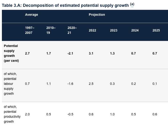
It’s hard to overstate how bad this is. They basically see potential growth at less than half what the OBR were projecting in November. And by historical standards the OBR’s forecast is itself very pessimistic:

So what explains this huge difference?
One thing we can rule out is assumptions about immigration as both organisation use the same pessimistic net migration assumption of 205,000 per year. As I argued in November, this is likely to be a significant underestimate.1
This leaves differences in labour market participation rates, hours supplied as well as capital deepening and productivity as possible differences. Let’s look at some of these:
Participation rates: The OBR predicts a participation rate of 63% over the forecast period. The Bank of England is more pessimistic, seeing participation falling from 63% this year to 62.5% in 2025. They see this as driven by older workers leaving the labour market. Some of this is due to people taking early retirement during the pandemic. But some of it is also linked to ill health, possibly the result of ‘long Covid’ and delays in treatment.
While this may seem like a small difference it’s obviously a huge deal given that labour is the bedrock of all output. A fall to 62.5% would take labour participation far below it's trend over the past 20 years:

Average hours of labour supplied: While the OBR expects average hours of labour supplied to hold constant, or if anything grow ever so slightly, the Bank expects average hours supplied to actually fall. Like with the participation rate, they argue that an ageing workforce is going to be willing to supply fewer hours.
These differing assumptions about labour participation and hours supplied probably explain why the Bank sees only 0.1% in potential supply growth from labour while the OBR sees around 0.5% per year.
This leaves differences in capital deepening and productivity: Here again, the OBR are much more optimistic, assuming about 1% of growth a year from capital and productivity compared to the Bank’s 0.6%.
One possible reason for the Bank’s pessimism is Brexit where they see the negative impact ‘emerging more quickly than previously assumed’:


While the Bank has brought forward the forecast impact of Brexit, I don’t think this explains all of the differences as the OBR is similarly pessimistic about the total hit to potential output (a 4% hit).
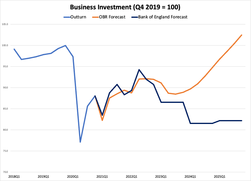
A much more convincing factor is the extraordinary difference in forecasts of business investment growth:
Some of this is Brexit, but a lot of it is down to other factors. The Bank is pretty pessimistic about the long term scarring from the energy price spike. They may also put more weight on the impact of tighter financial conditions. It’s also, I suspect, largely influenced by judgements about demand (on which more in the next section).
Lastly there are differences in assumptions about total factor productivity (TFP). The Bank don’t give numbers for this but they do assess that the pandemic has reduced skill levels of workers which they see as a continued drag in the years ahead:

Overall, I think the Bank’s supply side forecast is quite a significant underestimate. It has some interesting elements. Particularly its assumptions about an aging workforce and the potential scarring from COVID-19. But, the pessimism about business investment is almost impossible to believe. To believe this forecast is to believe that the UK will see a hit to investment on the scale of the Great Financial Crisis. I find it hard to be as pessimistic as that. There is no financial or liquidity crisis and the energy crisis hasn’t been as bad as initially forecast. Brexit is definitely as drag but doesn’t come close to explaining business investment falling 20% from pre-COVID-19 levels.
Demand side
The Bank is also super pessimistic on demand. Driving a lot of this is a very high forecast saving ratio. In 2024 and 2025, the Bank is forecasting the saving rate a huge 4ppt higher than the OBR:2

The Bank clearly takes the view that higher mortgage rates, more attractive interest rates and a weaker labour market will keep saving ratios near to the peaks seen in the GFC.
The OBR, on the other hand, project the saving rate falling to the lows of 2016-2019 when rates were at near zero and the economy was growing more quickly.
It’s very hard to work out quite why there is such a big difference in these projections. There are some possible reasons but they seem pretty flimsy…
The first is that the Bank projects a higher unemployment rate of 5.25% (versus the OBR’s 4.9%) and a lower participation rate. Higher unemployment, and the threat of it means less consumption, less borrowing and a higher saving ratio. The problem with this explaination is that, this higher unemployment rate, will to a significant extent be driven by a higher forecast saving ratio. It's therefore fairly circular and implies that it's other factors which are driving the differential.
A second reason is different assumptions about elasticity of demand for energy. The OBR assume an own price elasticity of 0.1. The Bank doesn’t give a comparable number. Instead they use the elasticity of substitution, which they place between 0.15 and 0.3. It’s pretty hard to compare these numbers but I asked a very good economist and under certain fairly reasonable assumptions, these elasticity of substitutions can be thought of as giving a higher own price elasticity of demand than the OBR’s 0.1. More elasticity in the Bank forecast means more cutting down on energy to pay for other goods and services rather than drawing on income that would otherwise be saved. This may explain some of the difference. But again, it’s hard to believe this explains a significant part of the difference, especially further out in the forecast where energy prices are forecast to fall further (and where this dynamic will matter less and less).
Third - different assumptions about excess savings built up when people couldn’t spend during COVID-19. The bigger financial buffers households have, the lower the saving ratio will be going forwards. The Bank thinks that these savings have been wiped out by falling asset prices and inflation. It’s possible that the OBR aren’t as pessimistic although they don’t actually say in their November report.
Overall, it’s very hard to find obvious reasons for why these forecasts of the saving ratio are so different. A lot of it may come down to assumptions about behaviour in the models. In particular, how averse people are to saving or consuming under different positive and negative pressures. If forced to make a judgement I think the Bank is being too pessimistic here, but unlike their business investment forecast, it’s not as implausible.
Output Gap: Putting supply and demand together
Putting together the very weak supply and demand forecast, the Bank project a negative output gap throughout the forecast period:

As covered earlier, I think the supply side forecast is quite pessimistic. The demand side forecast is also on the pessimistic side, although maybe not to quite the same extent.
Roughly speaking then, I think they are right to be projecting output gaps. But, if anything, the output gap might be bigger, although growth should also be higher and inflation persistence should be lower.
This conclusion is clearly very different to what the Bank says themselves. Despite forecasting an output gap, they remain worried about inflation. This is all because of what’s happening in the labour market…
Labour Market
The Bank remains worried that unemployment has remained remarkably low and wage growth hasn’t abated much, if at all, despite significant rate hikes:

The risk, under this view, is that higher pay growth, and very low unemployment, could then cause further rounds of price rises and embedded inflation expectations.
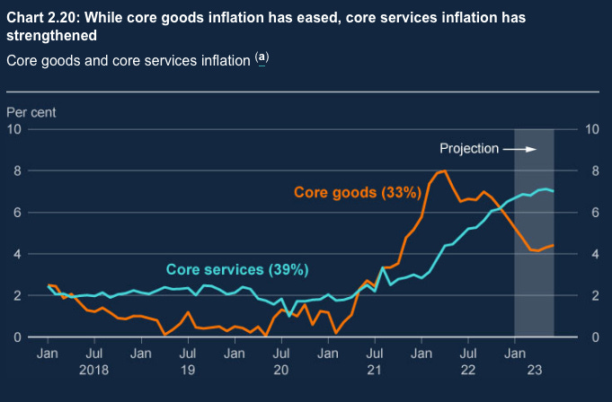
The risk is particularly acute, so the argument goes, in the services sector where labour costs make up a larger proportion of total costs:
I think this view may be more persuasive in America where the economy is actually really strong but I find it hard to believe it in the UK where economic weakness should provide downwards pressure. In addition there are a number of reasons to be dovish about wage and services inflation from here on out.
First, the impact of higher commodity and energy prices on services probably takes longer to pass through. Therefore I think it’s credible that rises in services inflation are still to a certain extent, due to the initial energy and commodity shock.
Second, inflation expectations are well anchored. This doesn’t mean that employees won’t demand some catch-up with the price shock. But it does mean that after the catchup, their wage demands should come quickly back down to trend:

The big question then is, when does this pivot actually happen? In my view, with energy prices no longer rising (and likely to fall further), and with such a sluggish economy, we are probably getting close to that point already.
We can see early signs of this in the KPMG pay growth measure. It shows that pay offers to new employees are already falling and are back to pre-COVID-19 levels. This is usually a good early indication of pay deals for the labour market as a whole:

Conclusion
While I think the Bank’s forecasts are too pessimistic, I do think the essential point is right, that with the energy price shock hopefully behind us, and with a very sluggish economy, inflation is going to come down quickly, and could even undershoot.
The actual messaging from the MPC, on the other hand is much more hawkish. This can be confusing at times given what their own projections say but is understandable when inflation is still running way above target, and with wages still running hot in the official data.
If I had to bet on what comes next, I would say that the Bank keeps rates high until the second half of the year before cutting more rapidly, and to a lower level than the markets currently expect:

The idea that rates in the UK will settle roughly where they are priced to settle in the US seems hard to believe given how much weaker the UK economy is likely to be. There is also likely to be a certain amount of compensation for keeping rates higher now than they arguably need to be.
Since both these forecasts were made, the ONS have slightly revised up their net inwards migration assumption to 245,000 per year from 2026.
Caution is needed with this data. The saving ratio includes pension saving (changes in net equity in pension reserves) which often makes up a majority of the total figure. For demand over the next few years it’s really household saving that matters but the Bank doesn’t decompose these numbers so we have to go with this headline saving ratio here.
Note: Charts without attribution are my own, using publicly available data.