
The UK's crazy labour market

One of the more UK specific worries for investors and economists at the moment is the labour market. While labour markets are hot everywhere, the UK seems to have an unprecedented mismatch between supply and demand:


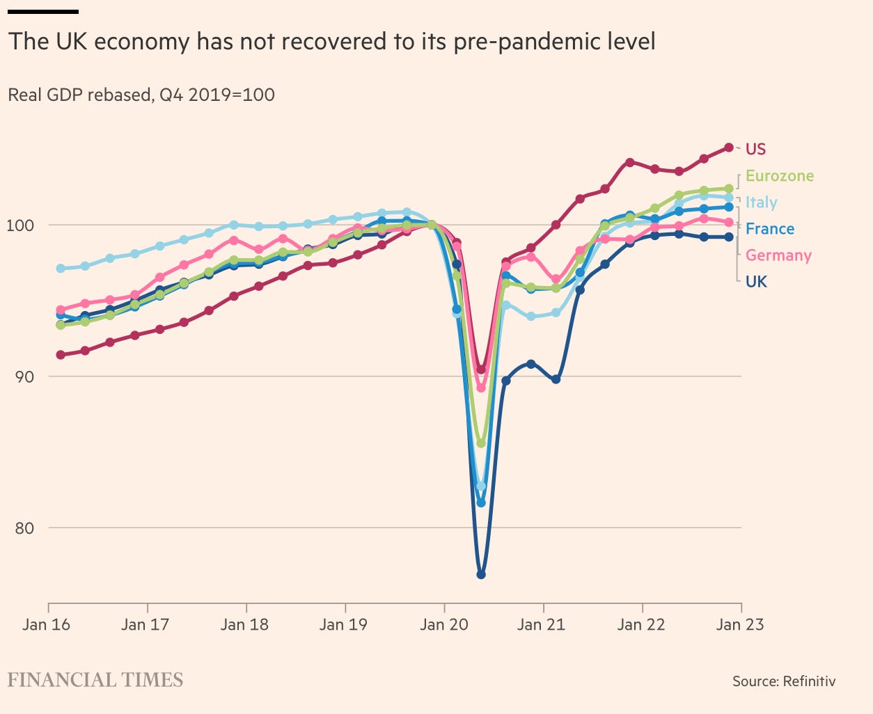
If the UK economy was performing well, this might make slightly more sense. But the UK is the worst performing of its peers:
On the face of it then, there is a risk of stagflation with higher rates needed to bring inflation down at the cost of growth.
Understandably there are a lot of people worried about this. But I’m less convinced. I think the data is improving. I also think the extent to which this data has been interpreted as inflationary is mistaken. Let’s look in more detail.
The Data: Labour Supply and Demand
Digging into the latest numbers released yesterday, the UK labour market looks tighter than at any point in the last 20 years:

Supply (in blue) is made up of people who are employed and those seeking employment. Since COVID there has been a clear downturn in supply. Most of this is due to people in their 50s and 60s retiring early or struggling with more health issues and longer wait times for treatment.
Demand (in orange) is made up of total employment plus total vacancies which is decomposed below:
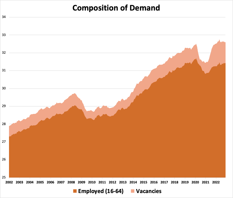
Employment in absolute terms is yet to reach its pre-COVID peak but as a proportion of the economically active is now at a record high (and hence the unemployment rate is at a record low).
More interestingly, the vacancies element of labour demand is still at near record highs:

While vacancies were always going to compensate for the COVID-19 dip, what worries people is that they’ve remained so high, almost two years on, especially when employment levels are pretty healthy (albeit not quite as high as pre-COVID levels).
So what explains this vacancies explosion?
The standout reason for this dynamic in the UK is the change in immigration rules from the end of 2020 as a result of Brexit. ‘Low-skilled’ workers from the EU could no longer migrate and take jobs in the UK as they had over the past 20 years or so. This has made it harder for firms to fill roles.
Another possible reason, although not specific to the UK, is a change in how employers advertise for new roles. The vacancy data asks businesses how many vacancies they are advertising externally. WFH and other COVID disruptions may have changed firms behaviour in this regard, making them more likely to advertise externally when previously they may have just looked internally.
Finally, some argue that monetary policy stayed way too easy after COVID-19 restrictions ended in 2021 and early 2022. With monetary policy impacting with lags, the current tightness may be reflecting these prior easy financial conditions. Personally, I find this hard to believe as this easy money story hasn’t really shown up in other data like business investment or consumer spending.
Labour market tightness is unlikely to last
The first piece of data suggesting a softening is the monthly, non-seasonally adjusted vacancies number which now seem to be falling fairly quickly:

Because it’s not seasonally adjusted we have to be very careful. But equally if vacancies are falling quickly, this is exactly what it would look like. The next few months of this data will be worth watching.
Next, there is the ONS data on weekly online job ads which looks to have returned to pre-COVID levels:

And although still very low, the redundancy rate is also returning to where it was pre-COVID:

This suggests that firms cannot afford to hold on to workers or are slowly finding it easier to hire again.
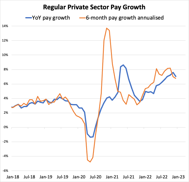
Finally, pay growth looks to be rolling over in the data up to the end of December:
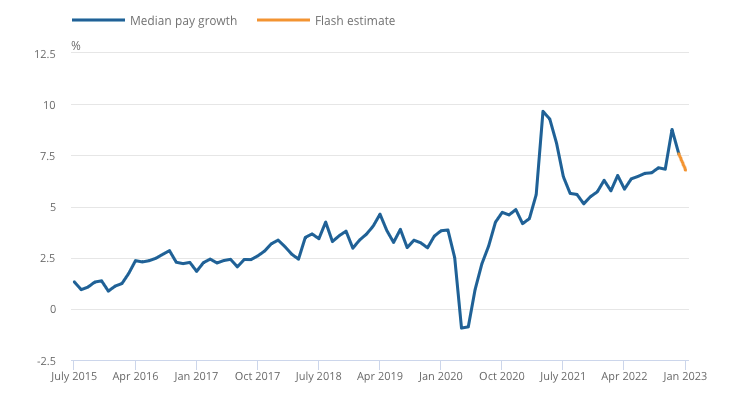
The ONS also produce an estimate using PAYE data which suggests a further fall in January:
Overall, in my view, this data is softening but it’s still not definitive and others will disagree entirely. What might matter more is what this data is actually telling us…
The Data might not be showing us what we think it does
The implicit assumption with this sort of data is that labour market tightness as measured by the unemployment rate or the mismatch between labour supply and demand is linked to inflation. This is just the standard inflation-unemployment Phillips curve tradeoff. The tighter the labour market, the more inflation there will be.
However, this has categorically not been the experience of the last 20 years in the UK. From 2001 onwards, I’ve plotted labour market tightness (labour demand divided by labour supply) on the Y axis against core inflation (CPI excluding energy, food, alcohol and tobacco) on the X axis:
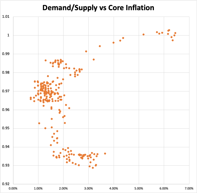
If there was a strong positive labour market ‘tightness’ to inflation relationship you would expect to see the points going from bottom left to top right. Instead there is no strong relationship in any direction.
The only hint of a relationship are the dots moving towards the top right corner, but these are all from 2022 onwards as the energy and food supply shocks kicked in.
Although I’m using core inflation, these price shocks still feed through as second round effects. E.g. service providers have to pay more to heat their offices. Hospitality providers need to pay for food. These costs, at least in part, are then passed on. Removing post-March 2020 data removes any semblance of a positive relationship:

This doesn’t definitely mean there isn’t any relationship. This is by no means a rigorous statistical analysis! But you might expect too see at least something!
One counterargument is to say that it’s only when the labour market is really tight that it really starts to cause an uptick in inflation. A sort of Keynesian aggregate supply curve relationship:

By this logic, it’s only when the labour market gets really hot, perhaps under conditions that we are seeing at the moment that the labour market creates upwards inflationary pressure.
One way to check this is to plot the data with with a 12 month lag between labour tightness and inflation. After all if there is not just correlation but also a causal relationship, it’s unlikely to be instantaneous. Here’s the plot:

On the right hand side you can see inflation picking up in 2022. Crucially, inflation picks up before labour tightness which is consistent with a supply shock and not overheating in the labour market.
Now again, this isn’t exactly rigorous, but if a clear labour market to inflation relationship exists in a reliable way which is valuable for predictions and policy making, well, I’m struggling to see it.
Finally, we do actually already have evidence of labour demand outstripping supply, without inflation taking off. Look at the labour market in the US in the 2 or 3 years before COVID:

And yes the Fed was hiking a little bit at the time, but monetary policy was still much, much easier than it is now.
In Conclusion…
I’m not suggesting that the Phillips curve relationship doesn’t exist at all. It probably does. But even within that framework we have to be very careful in how we interpret the current labour market data for a number of important reasons.
The first is that we are enduring a supply shock. That has been the single largest driver of inflation, even in the core data that strips out the direct impact of the price shocks in energy and food. This can be thought of a shift in the Phillips curve. For any level of unemployment, inflation is just going to be higher:

Second: when looking at this labour market to inflation relationship, we need to be really careful in what we are actually comparing. Unemployment rates and vacancy data play an important part in the wage/price picture but there is much more to it as well. For example, if we also look at hour worked, we see that they have actually gone down:

This suggests labour market easing. Yes, unemployment is very low, but the workers are working less. That’s slack that’s not been picked up at all in the unemployment and vacancies data above.
Third, we need to take account of the ability of firms to actually raise prices if and when wage pressure rises. Here it’s important to remember that the participation rate isn’t just a supply side issue. Yes, fewer workers can mean a tighter labour market, but it also means fewer wage earners1, which in turn means less demand. Consumer expectations about the future also matter. Consumers might be holding back because of uncertainty caused by the confluence of recent shocks. As I covered last week, the Bank of England certainly thinks this is what's happening.
Fourth, inflation expectations are very well anchored:

This is important because the current inflation is often compared to inflation in the 70s or early 80s. But inflation targeting didn’t even exist then and independent central banks were few and far between. It was much more rational to be backwards looking at the time. You didn’t even know where inflation was supposed to go and there was much less of a reason to trust hawkish statements. In the current inflation I would argue that wage demands are far more disciplined. Employees will demand some catchup to compensate for all the price shocks, but aren’t going to keep on asking for 6/7/8% pay rises consistently from here on out.
In sum, the UK labour market by conventional measures is very tight, but I think the extent to which this is driving and will continue to drive inflation is often overstated.
This is kind of like a reverse ‘lump of labour’ fallacy. When more people come and enter the workforce, there are also more people with incomes to spend. When people leave the workforce, there are fewer people with incomes to spend.